

An Astonishing Century of Progress in One Map
100 years ago, London to Sydney was a 40 day journey. Today, it takes 23 hours. Soon it will take two.

by Rod D. Martin
December 23, 2015
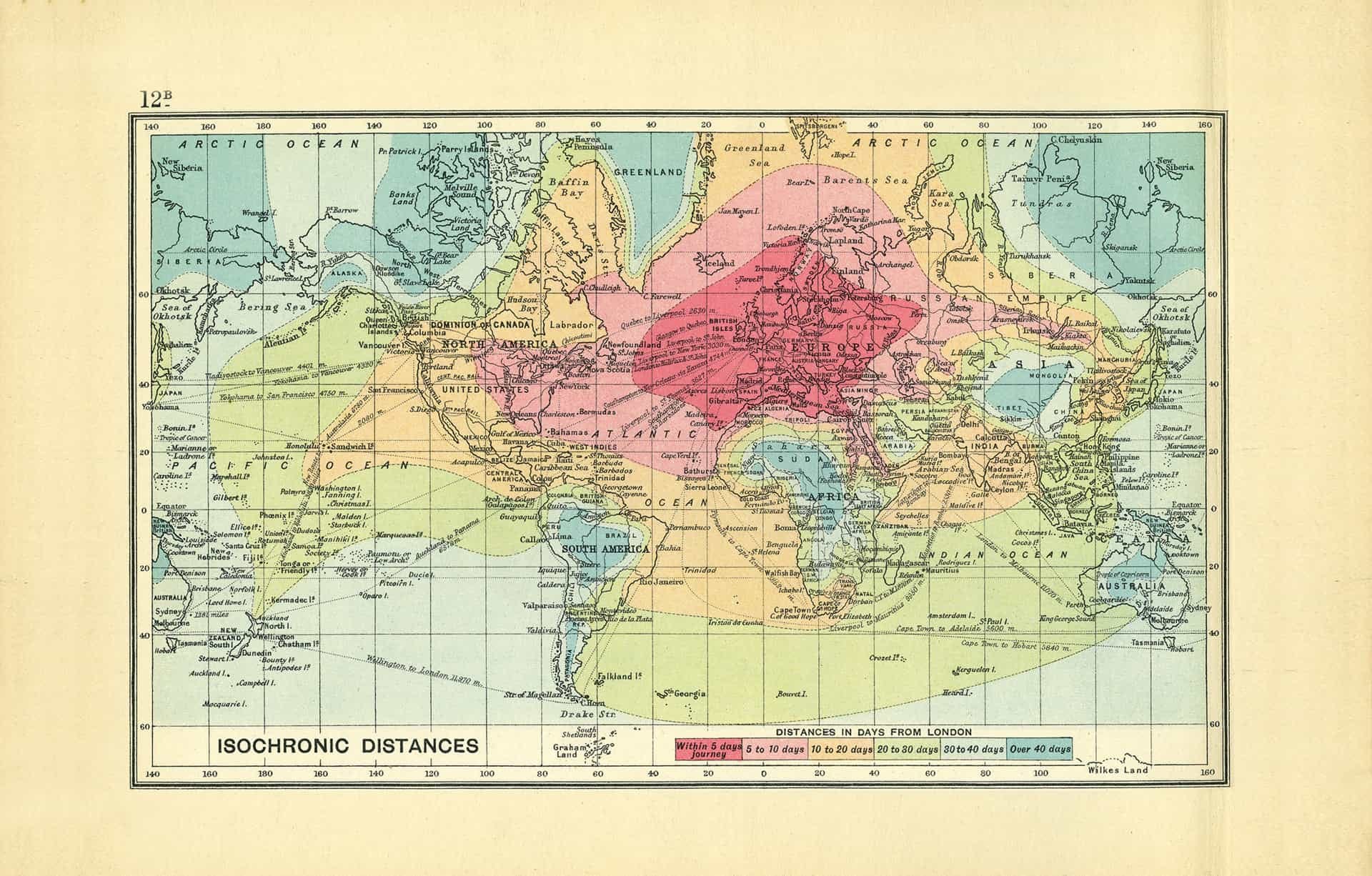
Earlier this month, the Telegraph published an astonishing map, showing exactly how long it took to travel from London to anywhere else in the world. The map was created for King George V in 1914 — just over 100 years ago — by John George Bartholomew, the Royal Cartographer (and speaking of distance, that is an awfully short distance in time since "Royal" really meant something).
The map is sectioned in colorful isochrones, lines that connect all points that are accessible within the same amount of time from London.
As our friends at HumanProgress.org point out, the map shows that London to Sydney was — in the lifetime of some of our readers — a 40 day journey.
Today, it takes 23 hours. And as we reported just a few days ago, thanks to the SABRE engine and scramjets, in just a few years that will shrink to something between two and four.
The map is extraordinary.